Sep 21

And that reminds me… some people requested that I upload the slides of the GNOME CLUG talk I presented a few weeks ago. Get them here.

And that reminds me… some people requested that I upload the slides of the GNOME CLUG talk I presented a few weeks ago. Get them here.


This website is (c) 1999-2007 Jonathan Carter. The views expressed on this site do not necassarily reflect the views of any of Jonathan's affiliates, employers or any other related entities.
If you would like to re-use any content from this site, please contact me, and I will consider licensing the content under a license that is convenient to you.
September 21st, 2007 at 4:07 pm
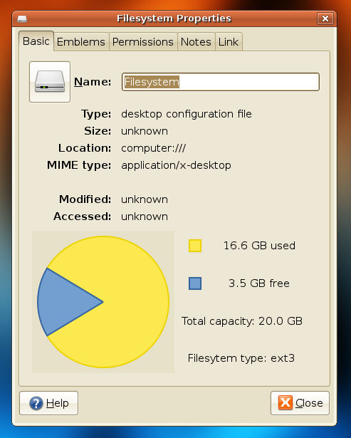
Am I the only one who thinks that this chart is way too big?
September 21st, 2007 at 4:44 pm
I think the dark gray box surrounding the chart looks ugly. The size looks fine to me though.
September 21st, 2007 at 4:49 pm
I agree that the chart is a bit big. The dark gray box in the background *might* be due to a GTK bug, I haven’t tested yet.
The pie chart for your disks is a new feature in Gnome 2.20 (pity it only has it now, since Windows had it since Windows 95). Help make it better in future (post-gutsy) versions of Ubuntu- file bugs at http://bugs.launchpad.net
September 22nd, 2007 at 5:00 pm
http://igordevlog.blogspot.com/2007/09/my-filesystem-type-is-packman.html
@jonathan: You are not the only one that gets pacman
@All: I think that the gray box is a theme issue of Jonathan theme, because as you see in my screenshot I get no grey box, and the chart size looks very good to me.